Responsive Website Design for Mobile Friendly
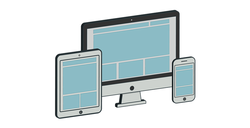
If you have a website, you should ensure that your website becomes responsive to all types of devices. Sounds clear? You can also replace the term ‘Responsive’ with ‘Adaptability.’
However, in this busy online world, the number of people who browse the internet from their mobile phones is gradually increasing.
Therefore, when you make or design any website, you have to make sure the website performs better on the big screen like a PC laptop and the small screen like mobile and tab.
Nevertheless, in this guide, we’ll cover:
- What is a responsive website design for mobile friendly?
- Why is it essential to make a mobile-friendly website?
- How to make mobile-friendly web design?
Now, let’s dive deeper.
What Is a Responsive Website Design for Mobile-Friendly?
The core concept of mobile-friendly website design is to make the website suitable for browsing on mobile phones. In most cases, if you only design your website considering the PC and laptop users in mind, your potential visitors won’t get any value from your website.
In mobile-friendly website design, the webpages and their layouts are perfectly displayed so mobile users can easily interact with their smartphones or tabs.
However, don’t think there is a difference between a website for computer users and a website for mobile users. The features and functions will remain the same. Here, the main difference is in the layout and some website navigation menus.
But, a single website may perform differently for desktop and mobile users. We often see many websites that work decently for desktops. But, when it comes to mobile, they perform so poorly.
Why Is It Essential to Make a Mobile-Friendly Website?
More than 50% of people in the United States browse the internet with their mobiles. Furthermore, the number is increasing rapidly. The possible reason is that mobile phones are easy to carry, and you can start browsing the internet anytime you want.
Therefore, if you avoid the fact of mobile-friendliness while designing your website, you may lose a lot of potential buyers. No matter what website you want to develop, it is always important to make it with a mobile-friendly layout.
However, apart from the user’s perspective, a mobile-friendly website can also help you rank higher on the Search Engine Result Page (SERPs). Google likes that websites that can perform excellently on mobile devices.
So, the next time you design any website, make sure the website is mobile-friendly.
How to Make Mobile-Friendly Web Design?
Now, this is important. You know what a mobile-friendly website is and why a mobile-friendly website is so important. But the question is how to make a mobile-friendly website.
First thing first, you have to be pretty much careful about the navigation of your website. Make sure you design the navigation sections in a suitable way for desktop and mobile users.
Furthermore, you also need to ensure that your website’s static content doesn’t change while designing a mobile-friendly website. Do remember another important thing, which is that the images optimized for a mobile-friendly website should be smaller.
Tags
About The Author
Posts You might like